Thursday, January 10, 2013

Second Grade - DuBuffet Journals

Jean DuBuffet Art Journals

Students studied the artwork of French artist, Jean DuBuffet.  They loved saying his name, ask them to pronounce it for you. 
We also studied the color wheel and focused on our primary colors and what primary colors can do.
Students designed an original art journal in the style of Jean DuBuffet, using a primary color scheme.
During our instruction I played this youtube video about color theory:  click link below


They loved this video and still sing it today!


Kindergarten-Don't Let the Pigeon Teach Art!

Don’t let the Pigeon teach Art!
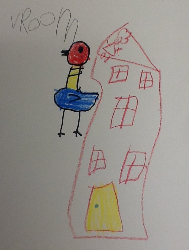
Kindergarten read the award winning book:
Don’t let the Pigeon Drive the Bus!
By: Mo Willems
There is also a very fun and educational pigeon app you can download from the app store.
We drew our Pigeons using sharpie marker and then we colored are pigeon with crayon.
We used primary colors to color our pigeons.
Some students gave their pigeons unique characteristics.


Kindergarten Architects


Kindergarten
Architects
Kindergarten looked at several types of home designs… from tree houses to igloos. 
We also looked at the website of a local, working architect in Rock Hill, and the homes he designs.
We talked about geometric shapes and blue prints.
We designed blue prints, just like real architects, using a printmaking process.

Wednesday, January 9, 2013

3rd Grade - Klimt Trees

Klimt: Tree of Life
This unit was titled:  The world we live in.
Third grade studied the artist Gustav Klimt.  We looked at Klimt’s artwork and pointed out things like:  color, pattern, material’s used and overall design. 
We decided to make the trees in our world, look like Klimt’s: Tree of Life.
Students used colored pencil to create pattern in their trees.  They used watercolor (shine) to create a jewel like quality to their designs, much like Klimt’s work.
Good job Third Grade!
Abstract
Analogous Colors
Tempera Paint
Fifth Grade studied the color wheel.  They learned how to mix colors to get other colors.  We reviewed primary, secondary, complimentary, warm and cool colors.
Then we added the word, Analogous, to our vocabulary.  Analogous colors are three colors that are right next to each other (or neighbors) on the color wheel.
Students created abstract works using yarn and black paint. 
Next they used an analogous color scheme, using tempera paint as their media.
They had to mix their colors using only primary colors: Red, Yellow & Blue.
We were going to make these into our personal art journals, but we thought they were too beautiful to fold in half.
Bravo Fifth Grade!

Cubism: Landscape

This unit was titled:  The world we live in.

Fifth grade studied the artistic movement called:  Cubism.

Cubism is considered the most influential art movement of the 20th century.  Leading artists of the cubist movement were: Pablo Picasso, Georges Braque, etc…

We looked at several artworks from the cubist movement and discussed Cubist artwork:

objects are analyzed, broken up and reassembled in an abstracted form—instead of depicting objects from one viewpoint, the artist depicts the subject from a multitude of viewpoints to represent the subject in a greater context.

Students also discussed landscape: what is it, what does it look like outside my door, down the street, in the city, across the ocean?

Students drew their idea of an ideal landscape.  Then they used elements from Cubism to break up their landscape, creating a reassembled effect.

Nice work Fifth Grade!

Abstract/Complimentary Color scheme


Fourth Grade studied the color wheel this fall.  They learned why some colors go better together, than others.  These are called complimentary colors.

Students created abstract works using yarn and black paint. 

Next they created a complimentary color scheme, using watercolors media.

We were going to make these into our personal art journals, but we thought they were too beautiful to fold in half.

Bravo Fourth Grade!